[OpenHAB] Share a Remote-Control Widget for LG WebOS TV

Nghia Phan
Table of Contents
Requirements
- OpenHAB version: 4.3.3
- The LG WebOS binding is installed.
I redesigned this widget based on widgets shared on the OpenHAB community site. If you copy it, please keep the attribution. ^^.
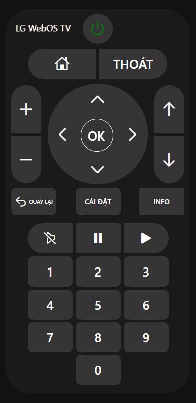
Usage
- Open MENU > Developer Tools > Widgets, add a new widget, paste the code, and enjoy.
uid: LGWebOSremotetags: []props: parameters: - context: item description: Select the RCButton item label: Simulate a Remote Control button press name: item required: true type: TEXT - context: item description: Select the Power switch item label: Power ON/OFF TV name: power required: true type: TEXT - context: item description: Select the Mute switch item label: Mute audio of the device name: mute required: true type: TEXT parameterGroups: []timestamp: Mar 11, 2025, 8:00:38 PMcomponent: f7-cardconfig: style: --f7-card-margin-horizontal: 0px background-color: rgb(26, 26, 26) border-radius: 50px height: 48rem width: 23remslots: default: - component: Label config: style: color: white font-size: 18px left: 20px top: 22px line-height: 32px overflow: hidden position: absolute text-overflow: ellipsis text-shadow: -1px 1px 1px hsl(0,0%,66%) white-space: nowrap text: ="LG WebOS TV" - component: oh-button config: action: command actionCommand: "=(items[props.power].state === 'OFF') ? 'ON' : 'OFF' " actionItem: =props.power iconF7: power iconSize: 30 color: white style: background-color: rgb(53,53,53) color: "=(items[props.power].state === 'OFF') ? 'green' : 'red' " display: flex border-radius: 50% height: 60px left: 154px position: absolute top: 10px width: 60px - component: oh-button config: action: command actionCommand: HOME actionItem: =props.item iconF7: house iconSize: 30 style: background-color: rgb(53,53,53) border-radius: 50px 0 0 50px color: white display: flex font-size: 25px height: 60px left: 45px position: absolute top: 80px width: 136px - component: oh-button config: action: command actionCommand: EXIT actionItem: =props.item text: THOÁT style: background-color: rgb(53,53,53) border-radius: 0 50px 50px 0 color: white display: flex font-size: 25px height: 60px left: 187px position: absolute top: 80px width: 136px - component: oh-button config: action: command actionCommand: VOLUMEUP actionItem: =props.item iconF7: plus iconSize: 35 style: background-color: rgb(53,53,53) border-radius: 50px 50px 0 0 color: white display: flex font-size: 25px height: 95px left: 11px position: absolute top: 153px width: 60px z-index: 2 - component: oh-button config: action: command actionCommand: VOLUMEDOWN actionItem: =props.item iconF7: minus iconSize: 35 style: background-color: rgb(53,53,53) border-radius: 0 0 50px 50px color: white display: flex font-size: 25px height: 95px left: 11px position: absolute top: 253px width: 60px z-index: 2 - component: oh-button config: action: command actionCommand: UP actionItem: =props.item iconF7: chevron_up iconSize: 35 style: border-radius: 50% color: white display: flex font-size: 25px height: 60px left: 154px position: absolute top: 150px width: 60px z-index: 2 - component: oh-button config: action: command actionCommand: RIGHT actionItem: =props.item iconF7: chevron_right iconSize: 35 style: border-radius: 50% color: white display: flex font-size: 25px height: 60px right: 84px position: absolute top: 220px width: 60px z-index: 2 - component: oh-button config: action: command actionCommand: DOWN actionItem: =props.item iconF7: chevron_down iconSize: 35 style: border-radius: 50% color: white display: flex font-size: 25px height: 60px left: 154px position: absolute top: 290px width: 60px z-index: 2 - component: oh-button config: action: command actionCommand: LEFT actionItem: =props.item iconF7: chevron_left iconSize: 35 style: border-radius: 50% color: white display: flex font-size: 25px height: 60px left: 84px position: absolute top: 220px width: 60px z-index: 2 - component: f7-badge config: style: border: white solid 1px background-color: rgb(53,53,53) border-radius: 50% height: 65px left: 150px position: absolute top: 220px width: 65px z-index: 2 - component: f7-badge config: style: border-radius: 50% background-color: rgb(53,53,53) height: 200px left: 84px position: absolute top: 150px width: 200px z-index: 1 - component: oh-button config: action: command actionCommand: ENTER actionItem: =props.item style: border-radius: 50px color: white display: flex font-size: 25px height: 65px left: 149px position: absolute top: 220px width: 65px z-index: 2 text: OK - component: oh-button config: action: command actionCommand: CHANNELUP actionItem: =props.item iconF7: arrow_up iconSize: 35 style: background-color: rgb(53,53,53) border-radius: 50px 50px 0 0 color: white display: flex font-size: 25px height: 95px left: 297px position: absolute top: 153px width: 60px z-index: 2 - component: oh-button config: action: command actionCommand: CHANNELDOWN actionItem: =props.item iconF7: arrow_down iconSize: 35 style: background-color: rgb(53,53,53) border-radius: 0 0 50px 50px color: white display: flex font-size: 25px height: 95px left: 297px position: absolute top: 253px width: 60px z-index: 2 - component: oh-button config: action: command actionCommand: BACK actionItem: =props.item iconF7: arrow_uturn_left iconSize: 25 style: background-color: rgb(53,53,53) border-radius: 10px color: white display: flex font-size: 11px height: 55px left: 11px position: absolute top: 357px width: 90px text: BACK - component: oh-button config: action: command actionCommand: MENU actionItem: =props.item style: background-color: rgb(53,53,53) border-radius: 10px color: white display: flex height: 55px left: 140px position: absolute top: 357px width: 90px text: MENU - component: oh-button config: action: command actionCommand: INFO actionItem: =props.item text: INFO style: background-color: rgb(53,53,53) color: white display: flex height: 55px left: 267px position: absolute top: 357px width: 90px - component: oh-button config: action: command actionCommand: MUTE actionItem: =props.item color: "=(items[props.mute].state === 'OFF') ? 'white' : 'red'" iconF7: speaker_slash_rtl iconSize: 30 style: background-color: rgb(53,53,53) border-radius: 50px 0 0 50px display: flex font-size: 25px height: 60px left: 44px position: absolute top: 428px width: 90px - component: oh-button config: action: command actionCommand: PAUSE actionItem: =props.item iconF7: pause_fill iconSize: 30 style: background-color: rgb(53,53,53) color: white display: flex height: 60px left: 140px position: absolute top: 428px width: 90px - component: oh-button config: action: command actionCommand: PLAY actionItem: =props.item iconF7: play_fill iconSize: 30 style: background-color: rgb(53,53,53) border-radius: 0 50px 50px 0 color: white display: flex height: 60px left: 236px position: absolute top: 428px width: 90px - component: oh-button config: action: command actionCommand: 1 actionItem: =props.item style: background-color: rgb(53,53,53) border-radius: 10px color: white display: flex font-size: 25px height: 60px left: 44px position: absolute top: 494px width: 90px text: 1 - component: oh-button config: action: command actionCommand: 2 actionItem: =props.item style: background-color: rgb(53,53,53) border-radius: 10px color: white display: flex font-size: 25px height: 60px left: 140px position: absolute top: 494px width: 90px text: 2 - component: oh-button config: action: command actionCommand: 3 actionItem: =props.item style: background-color: rgb(53,53,53) border-radius: 10px color: white display: flex font-size: 25px height: 60px left: 236px position: absolute top: 494px width: 90px text: 3 - component: oh-button config: action: command actionCommand: 4 actionItem: =props.item style: background-color: rgb(53,53,53) border-radius: 10px color: white display: flex font-size: 25px height: 60px left: 44px position: absolute top: 560px width: 90px text: 4 - component: oh-button config: action: command actionCommand: 5 actionItem: =props.item style: background-color: rgb(53,53,53) border-radius: 10px color: white display: flex font-size: 25px height: 60px left: 140px position: absolute top: 560px width: 90px text: 5 - component: oh-button config: action: command actionCommand: 6 actionItem: =props.item style: background-color: rgb(53,53,53) border-radius: 10px color: white display: flex font-size: 25px height: 60px left: 236px position: absolute top: 560px width: 90px text: 6 - component: oh-button config: action: command actionCommand: 7 actionItem: =props.item style: background-color: rgb(53,53,53) border-radius: 10px color: white display: flex font-size: 25px height: 60px left: 44px position: absolute top: 625px width: 90px text: 7 - component: oh-button config: action: command actionCommand: 8 actionItem: =props.item style: background-color: rgb(53,53,53) border-radius: 10px color: white display: flex font-size: 25px height: 60px left: 140px position: absolute top: 625px width: 90px text: 8 - component: oh-button config: action: command actionCommand: 9 actionItem: =props.item style: background-color: rgb(53,53,53) border-radius: 10px color: white display: flex font-size: 25px height: 60px left: 236px position: absolute top: 625px width: 90px text: 9 - component: oh-button config: action: command actionCommand: 0 actionItem: =props.item style: background-color: rgb(53,53,53) border-radius: 10px color: white display: flex font-size: 25px height: 60px left: 140px position: absolute top: 690px width: 90px text: "0" Tags:
#openhab
Comments & Discussion
Share your thoughts, ask questions and feedback