[OpenHAB] Share Widget điều khiển từ xa LG WebOS TV.

Nghia Phan
Mục Lục Bài Viết
Thông tin và yêu cầu
- OpenHAB version: 4.3.3
- Đã cài đặt LG WebOS binding
Widget do mình tự thiết kế lại dựa trên các widget có sẵn được chia sẻ trên trang chủ. Các bác copy nhớ ghi nguồn đầy đủ nhé ^^.
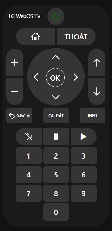
Hướng dẫn sử dụng
- Từ MENU > Develope Tools > Widgets > Thêm Widget mới, dán code và tận hưởng.
uid: LGWebOSremotetags: []props: parameters: - context: item description: Select the RCButton item label: Simulate a Remote Control button press name: item required: true type: TEXT - context: item description: Select the Power switch item label: Power ON/OFF TV name: power required: true type: TEXT - context: item description: Select the Mute switch item label: Mute audio of the device name: mute required: true type: TEXT parameterGroups: []timestamp: Mar 11, 2025, 8:00:38 PMcomponent: f7-cardconfig: style: --f7-card-margin-horizontal: 0px background-color: rgb(26, 26, 26) border-radius: 50px height: 48rem width: 23remslots: default: - component: Label config: style: color: white font-size: 18px left: 20px top: 22px line-height: 32px overflow: hidden position: absolute text-overflow: ellipsis text-shadow: -1px 1px 1px hsl(0,0%,66%) white-space: nowrap text: ="LG WebOS TV" - component: oh-button config: action: command actionCommand: "=(items[props.power].state === 'OFF') ? 'ON' : 'OFF' " actionItem: =props.power iconF7: power iconSize: 30 color: white style: background-color: rgb(53,53,53) color: "=(items[props.power].state === 'OFF') ? 'green' : 'red' " display: flex border-radius: 50% height: 60px left: 154px position: absolute top: 10px width: 60px - component: oh-button config: action: command actionCommand: HOME actionItem: =props.item iconF7: house iconSize: 30 style: background-color: rgb(53,53,53) border-radius: 50px 0 0 50px color: white display: flex font-size: 25px height: 60px left: 45px position: absolute top: 80px width: 136px - component: oh-button config: action: command actionCommand: EXIT actionItem: =props.item text: THOÁT style: background-color: rgb(53,53,53) border-radius: 0 50px 50px 0 color: white display: flex font-size: 25px height: 60px left: 187px position: absolute top: 80px width: 136px - component: oh-button config: action: command actionCommand: VOLUMEUP actionItem: =props.item iconF7: plus iconSize: 35 style: background-color: rgb(53,53,53) border-radius: 50px 50px 0 0 color: white display: flex font-size: 25px height: 95px left: 11px position: absolute top: 153px width: 60px z-index: 2 - component: oh-button config: action: command actionCommand: VOLUMEDOWN actionItem: =props.item iconF7: minus iconSize: 35 style: background-color: rgb(53,53,53) border-radius: 0 0 50px 50px color: white display: flex font-size: 25px height: 95px left: 11px position: absolute top: 253px width: 60px z-index: 2 - component: oh-button config: action: command actionCommand: UP actionItem: =props.item iconF7: chevron_up iconSize: 35 style: border-radius: 50% color: white display: flex font-size: 25px height: 60px left: 154px position: absolute top: 150px width: 60px z-index: 2 - component: oh-button config: action: command actionCommand: RIGHT actionItem: =props.item iconF7: chevron_right iconSize: 35 style: border-radius: 50% color: white display: flex font-size: 25px height: 60px right: 84px position: absolute top: 220px width: 60px z-index: 2 - component: oh-button config: action: command actionCommand: DOWN actionItem: =props.item iconF7: chevron_down iconSize: 35 style: border-radius: 50% color: white display: flex font-size: 25px height: 60px left: 154px position: absolute top: 290px width: 60px z-index: 2 - component: oh-button config: action: command actionCommand: LEFT actionItem: =props.item iconF7: chevron_left iconSize: 35 style: border-radius: 50% color: white display: flex font-size: 25px height: 60px left: 84px position: absolute top: 220px width: 60px z-index: 2 - component: f7-badge config: style: border: white solid 1px background-color: rgb(53,53,53) border-radius: 50% height: 65px left: 150px position: absolute top: 220px width: 65px z-index: 2 - component: f7-badge config: style: border-radius: 50% background-color: rgb(53,53,53) height: 200px left: 84px position: absolute top: 150px width: 200px z-index: 1 - component: oh-button config: action: command actionCommand: ENTER actionItem: =props.item style: border-radius: 50px color: white display: flex font-size: 25px height: 65px left: 149px position: absolute top: 220px width: 65px z-index: 2 text: OK - component: oh-button config: action: command actionCommand: CHANNELUP actionItem: =props.item iconF7: arrow_up iconSize: 35 style: background-color: rgb(53,53,53) border-radius: 50px 50px 0 0 color: white display: flex font-size: 25px height: 95px left: 297px position: absolute top: 153px width: 60px z-index: 2 - component: oh-button config: action: command actionCommand: CHANNELDOWN actionItem: =props.item iconF7: arrow_down iconSize: 35 style: background-color: rgb(53,53,53) border-radius: 0 0 50px 50px color: white display: flex font-size: 25px height: 95px left: 297px position: absolute top: 253px width: 60px z-index: 2 - component: oh-button config: action: command actionCommand: BACK actionItem: =props.item iconF7: arrow_uturn_left iconSize: 25 style: background-color: rgb(53,53,53) border-radius: 10px color: white display: flex font-size: 11px height: 55px left: 11px position: absolute top: 357px width: 90px text: QUAY LẠI - component: oh-button config: action: command actionCommand: MENU actionItem: =props.item style: background-color: rgb(53,53,53) border-radius: 10px color: white display: flex height: 55px left: 140px position: absolute top: 357px width: 90px text: CÀI ĐẶT - component: oh-button config: action: command actionCommand: INFO actionItem: =props.item text: INFO style: background-color: rgb(53,53,53) color: white display: flex height: 55px left: 267px position: absolute top: 357px width: 90px - component: oh-button config: action: command actionCommand: MUTE actionItem: =props.item color: "=(items[props.mute].state === 'OFF') ? 'white' : 'red'" iconF7: speaker_slash_rtl iconSize: 30 style: background-color: rgb(53,53,53) border-radius: 50px 0 0 50px display: flex font-size: 25px height: 60px left: 44px position: absolute top: 428px width: 90px - component: oh-button config: action: command actionCommand: PAUSE actionItem: =props.item iconF7: pause_fill iconSize: 30 style: background-color: rgb(53,53,53) color: white display: flex height: 60px left: 140px position: absolute top: 428px width: 90px - component: oh-button config: action: command actionCommand: PLAY actionItem: =props.item iconF7: play_fill iconSize: 30 style: background-color: rgb(53,53,53) border-radius: 0 50px 50px 0 color: white display: flex height: 60px left: 236px position: absolute top: 428px width: 90px - component: oh-button config: action: command actionCommand: 1 actionItem: =props.item style: background-color: rgb(53,53,53) border-radius: 10px color: white display: flex font-size: 25px height: 60px left: 44px position: absolute top: 494px width: 90px text: 1 - component: oh-button config: action: command actionCommand: 2 actionItem: =props.item style: background-color: rgb(53,53,53) border-radius: 10px color: white display: flex font-size: 25px height: 60px left: 140px position: absolute top: 494px width: 90px text: 2 - component: oh-button config: action: command actionCommand: 3 actionItem: =props.item style: background-color: rgb(53,53,53) border-radius: 10px color: white display: flex font-size: 25px height: 60px left: 236px position: absolute top: 494px width: 90px text: 3 - component: oh-button config: action: command actionCommand: 4 actionItem: =props.item style: background-color: rgb(53,53,53) border-radius: 10px color: white display: flex font-size: 25px height: 60px left: 44px position: absolute top: 560px width: 90px text: 4 - component: oh-button config: action: command actionCommand: 5 actionItem: =props.item style: background-color: rgb(53,53,53) border-radius: 10px color: white display: flex font-size: 25px height: 60px left: 140px position: absolute top: 560px width: 90px text: 5 - component: oh-button config: action: command actionCommand: 6 actionItem: =props.item style: background-color: rgb(53,53,53) border-radius: 10px color: white display: flex font-size: 25px height: 60px left: 236px position: absolute top: 560px width: 90px text: 6 - component: oh-button config: action: command actionCommand: 7 actionItem: =props.item style: background-color: rgb(53,53,53) border-radius: 10px color: white display: flex font-size: 25px height: 60px left: 44px position: absolute top: 625px width: 90px text: 7 - component: oh-button config: action: command actionCommand: 8 actionItem: =props.item style: background-color: rgb(53,53,53) border-radius: 10px color: white display: flex font-size: 25px height: 60px left: 140px position: absolute top: 625px width: 90px text: 8 - component: oh-button config: action: command actionCommand: 9 actionItem: =props.item style: background-color: rgb(53,53,53) border-radius: 10px color: white display: flex font-size: 25px height: 60px left: 236px position: absolute top: 625px width: 90px text: 9 - component: oh-button config: action: command actionCommand: 0 actionItem: =props.item style: background-color: rgb(53,53,53) border-radius: 10px color: white display: flex font-size: 25px height: 60px left: 140px position: absolute top: 690px width: 90px text: "0" Thẻ:
#openhab
Bình Luận & Thảo Luận
Góp ý, hỏi đáp và chia sẻ suy nghĩ của bạn